10 Pro Tips

Pro Tip #1

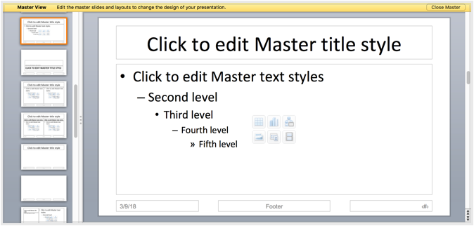
Don't use the slide master.

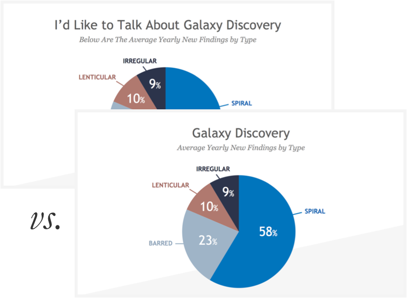
Aside from being hard to find and confusing to use, the slide master encourages a bulleted outline layout, which makes for very dull visuals. It is much easier to manage presentation layout by ignoring the slide master and instead copy-pasting elements directly onto each slide.

Pro Tip #2

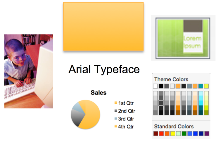
Don't use the defaults.

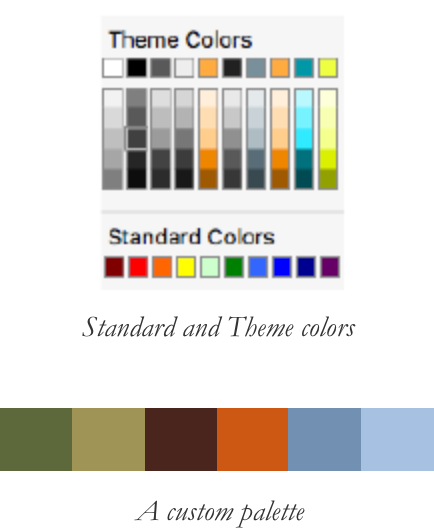
Default templates are in an awkward square dimension. Default fonts are too large. Default color palettes have too much repetition. Default shapes have loud colors and dated-looking shadows.

Pro Tip #3

Do use copyright-h3 images.

Googling an image is easy but finding one that is copyright-safe is difficult. It is better to use trusted sources to either buy an image license or find images that are copyright-free.

For more tips on sourcing images, go to the Finding Images section of Templates and Tips.

Pro Tip #4

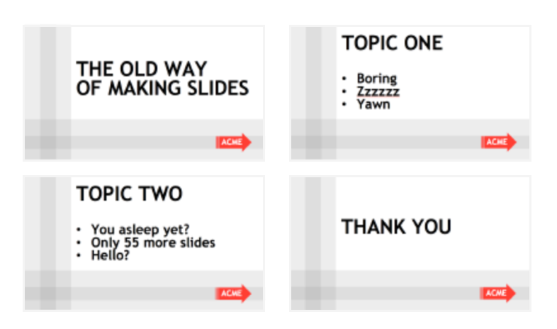
Don't brand every slide with your logo.

A logo on every slide not only makes your deck look dated, it takes up valuable space for your message. Your audience should be introduced to your company on the Cover Slide and reminded again on the Conclusion Slide.

Pro Tip #5

Do use interstitial slides to change topics.

An interstitial slide is a title page for a subtopic of your presentation. It gives your audience a visual cue to your topic change and is a great place to add visual interest.

Pro Tip #6

Do keep it one thought per slide.

For large audiences, rather than condense all of your thoughts into a minimum of slides, spread your message out. This aids in richer storytelling, audience comprehension and gives you room to illustrate your points.

Pro Tip #7

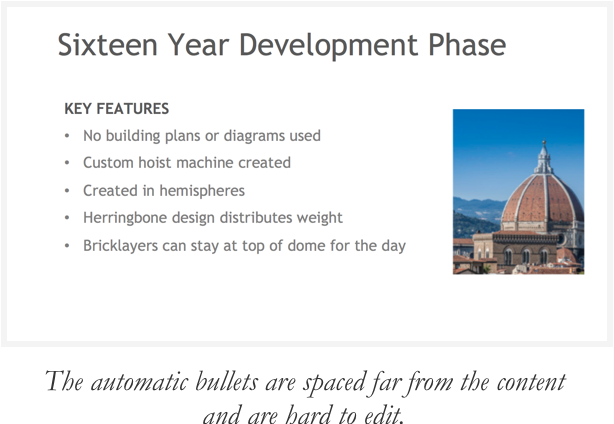
Don't use the automatic bullets.

Automatic bullets are clunky and hard to control. To mark a list of items, use a hyphen.

Conceptually, bullets are problematic because they are often used to outline the speaker's script, which makes for dull visuals and encourages the audience to read ahead rather than listen.

Pro Tip #8

Do trim text where you can.

Can your text be shorter and more succinct? Wherever possible, trim out passive phrases, conversational writing and adjectives, all which add visual clutter to a message.

Pro Tip #9

Do create a h3 color palette.

As mentioned in Tip #2, standard and theme colors are difficult to work with. Creating your own palette is easy and using it throughout your presentation will make the design cohesive.

Each Slide Therapy Template file has a worksheet which guides you through the process of creating your own custom harmonious color palette.

Pro Tip #10

Do use a dark template for a dark room.

For a large audience, if you know that the room that you will be presenting in will be very dark, consider using the dark background templates. Much like how dark backgrounds are easier for reading from your tablet in bed at night, the slides will be easier on your audience's eyes in a dark room.

The Large Audience Slide Therapy Template and Tips file contains both dark and light background slide designs.